
5 Key Colors for Spring/Summer 2022 at Offsite Online

Collection III by Pieces channels those comforting vibes of ‘Butter’ yellow.
The role of color in design has become even more important since the start of the new decade. In a time of information overload and diminishing attention spans, color can be one of the best tools for cutting through the noise and standing out. As consumers become increasingly demanding of brands and their values, expecting to invest in both a story and a mindset— as well as a product, color can play a key role in communicating the right message.
So, as brands clamor furiously for solutions that communicate their unique brand values, and consumers gravitate towards products that channel the themes of nature, wellness and localism— the timely release of the next seasons’ color trends by forecasting company WGSN in collaboration with Coloro —the latest in color-coding technology (think: a newer Pantone)— can be an asset to us all. WGSN’s Key Colors for Spring/Summer 2022—which tap into a variety of moods – calming, comforting, reassuring, and energizing— were selected for the aftermath of the current period of change and unpredictability.
S/S 22’s colors — Butter, Olive Oil, Atlantic Blue, Orchid Flower and Mango Sorbet— are all inspired by simple and sensorial pleasures, as they are predicted to come upon the scene at a moment in which consumers who are looking to feel safe again will gravitate towards mood-boosting products and experiences. The smell of a favorite book, the first forkful of a home-cooked meal, or the feel of freshly cut grass under our feet can all ignite feelings of joy, and these colors are meant to embody these moments with an almost tangible sense of depth, texture and saturation.
At kriteria, we took an extra step and, drawing from conclusions gathered during the latest WGSN webinar by the WGSN team— applied these trending tones to the world of interiors by using examples from the just-launched Offsite Online— the first online fair by digital magazine Sight Unseen— featuring 3D-rendered virtual booths and new work by nearly 100 designers, brands, and students.
As Head of Lifestyle and Interiors at WGSN, Gemma Riberti, says, consumers might finally be moving away from overusing those safe neutrals in their homes, in favor of balancing them with more energizing, brighter tones: “Color as a tool for self-expression comes into the home and interiors industry a lot, and now that we have been forced to spend a lot more time at home, we are seeing consumers actually daring to experiment with color more than before. At the same time, the colors used should also be reassuring, colors that you want to spend time with, that have longevity, and are timeless.”
Keep scrolling for eye-opening interiors in post-pandemic pigments.
Butter
Keywords: Creamy | Soft | Edible | Luxurious

Gemma riberti, Lifestyle & Interiors wgsn:
“Spring/Summer ‘22 is really all about this Post-COVID world. Our lives will be so dramatically disrupted by this outbreak, so it will take time to feel safe again, and color can be a key actor to doing that. Butter yellow is definitely warming and luminous, but also very tender very discreet and muted.
“Something that we always say is that you can’t talk about color without talking about the finish and the material that it’s applied onto, and whether it’s soft or hard, because all of these elements go into creating the multi-sensory experience. Looking directly at all the key colors and how they work in our industry, Butter is definitely one that we’ve been keeping an eye on, especially for Spring Summer, from walls to textiles, because it has that warmth, it brings in the light, but is also very soft, muted and can act almost like a neutral— this comes as we are seeing the rise of those tinted, warm, tactile neutrals more and more.”
Laura Yiannakou, Senior Womenswear Editor WGSN
“Butter yellow is my favorite, you’re seeing influential brands like Bottega Veneta really going to town with this.”
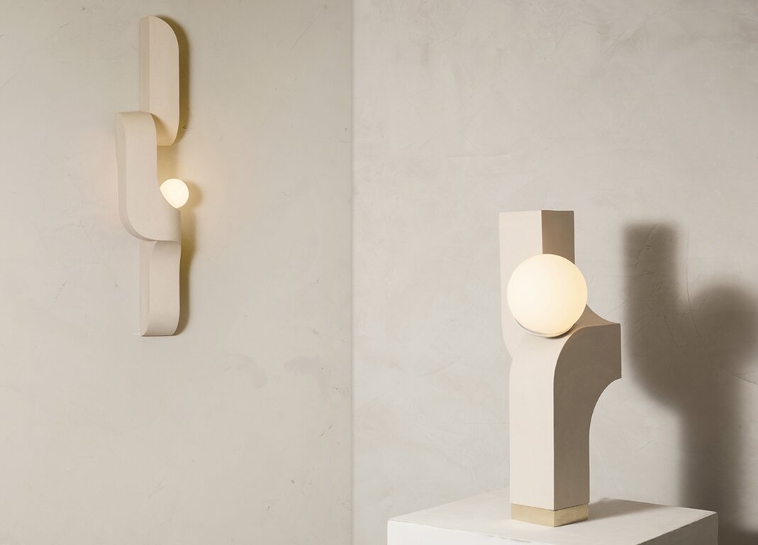
Serpentine Sconce and Scorpio Table Lamp by Farrah Sit.


Olive Oil
Keywords: Timeless | Comforting | Restful | Balanced


Tavolo Morbido Color Fade by Studio Mignone.
Gemma riberti, Lifestyle & Interiors wgsn
“In order to feel safe again, we need to look at colors that draw from the essentials: that olive green that references olive oil— it’s a pantry staple, a perennial, all-rounder, very versatile, dependable, it can work almost like a core color, and it’s very grounding, so it can empower all the other colors.
“It has a lightness, a paleness, that brings it closer to the other neutrals, for instance when it’s working with the Atlantic Blue, it’s such a beautiful utility, outdoor-inspired pairing as well, but also works in bed and bath, or outdoor textiles. It can create a fresh and lush story when you pair it with the mango and the orchid flower.”
Laura Yiannakou, Senior Womenswear Editor WGSN
“With Olive Oil, and the whole green family in particular, we are seeing a continuation in all the different components across the different womenswear categories. As Gemma described it, it is a pantry staple in color, and the same can be said in the category of womenswear.
“It’s that trusty tone that lends itself really well to utility wear, which we know is not going away, and the fact that the consumer is so rooted into investing in products and clothing that are durable and can promote that sense of longevity. I think that’s where we will really see it start to play out— as a continuation of utility for sure— so it’s also great for printed color ranges.”
Atlantic Blue
Keywords: Peaceful | Soothing | Gentle | Grounding

Gemma riberti, Lifestyle & Interiors wgsn
“Atlantic Blue will also be quite a staple both in the home and in the wardrobe. It has that faded tint that speaks to artisanal qualities.”
Laura Yiannakou, Senior Womenswear Editor WGSN
“Atlantic blue is that grounding and commercial shade, it’s very reassuring, and taps into the idea of bringing back those perennial trends.”


Soulmate Vase Blue Moon by Martina Guandalini.

Orchid Flower
Keywords: Intense | Hyper-Real | Energizing

Gemma riberti, Lifestyle & Interiors wgsn
“The Orchid Flower really tones down that electric magenta from last season, but still continues the conversation. It brings a digital twist with that hyper-natural saturation, because we are experiencing color quite a lot via our screens—so digital color will be more and more important.
“This fuchsia tone is unexpected, but we are starting to see it in interior collections, more at the directional level, in more limited edition collections and design galleries. So if the conversation is starting there, we really see it remaining more of an important color and growing more relevant as the next seasons start coming out. And it’s really key for using in small accents and great for uplifting the prints as well.”
Laura Yiannakou, Senior Womenswear Editor WGSN
“Orchid flower is obviously really beautiful, really uplifting. We need to use it strategically at a time like this, when, although you can imagine that the consumer wants to be uplifted by color, they probably will not be buying lots of color. We need to be mindful that the direction the consumer is headed at the moment is rooted in comfort.”
Mango Sorbet
Keywords: Invigorating | Tropical | Juicy | Delicious


Traipse Vase by Upstate.

HM01 Glaze in Pikachu Yellow by Field Tiles.
Gemma riberti, Lifestyle & Interiors wgsn
“There’s an emphasis on also bringing in some optimism, some positivity with Mango Sorbet, because bright tones will remain important, filling the need to energize those more sober colors; to motivate.”
Laura Yiannakou, Senior Womenswear Editor WGSN
“Mango sorbet is another beautiful shade for high summer and holiday, it’s quite bright— but not in your face bright.”

More trends
Forecasting two years ahead can be very tricky, but there are certain changes the WGSN team predicts will ripple through the industry in a post-COVID world.
Gemma riberti, Lifestyle & Interiors wgsn
The Home Hub
“As we grow more accustomed to spending more time at home, so that the home really becomes this central place, where it needs to be the safest and most reassuring place of all. Pushing the boundaries of ‘the home hub,’ a trend we have been tracking over recent seasons, and turning it into ‘the homebody hub’— we are all turning into home bodies. We are looking at the home as a safe cave into which we can re-energize, find mental well-being, as well as continuing to cultivate our physical well-being as much as possible. It may not be easy when we are sharing the flat, or when you have kids running around— there’s a lot of disruption that can happen, so it teaches us to use the space differently.
“And we will need to start designing homes in different ways. We will need to start offering solutions to making the home space more flexible, more versatile, meet different needs, meet the need to work from home more. There will be a lot of redesigning and rethinking that will impact all of this.”
Hygiene
“I think hygiene will also be more important; it will drive everything that we do. We will seek cleanliness everywhere; from the moment we enter the home and want to know that it is clean and safe, but also where we choose to spend time. So, in the office, in entertainment, our social life and real life will be impacted by this as well.”
Tech
“I think tech is being accelerated beyond our imagination, because we have become so dependent on it, we are realizing that it needs to become a staple. It is permeating everything that we do, so we will see an increased demand for smarter solutions in the home, in what we wear, and in the tools that we use for our physical and mental well-being.
“Contactless solutions will need to come into the everyday environment. And also tech linked to entertainment— the spike that we are seeing in gaming, for example—will continue to drive the way that we choose to mentally disconnect. Streaming services will also continue to be very relevant, so the disruption that has happened to the industry and to our lifestyles will be long-lasting.”
Laura Yiannakou, Senior Womenswear Editor WGSN
Creativity
“We’ve been amazed by the amount of co-crafting going on in households, which has been really uplifting to see. Not only is creativity being brought through to make people feel better about the situation, it’s also driving new connections, not only in households but also in local communities.”
Nature
“I think that there is a growing, continual love of nature as well. Spring is unfolding here, and nature is completely oblivious to what is happening, and it makes you feel grateful for the simple pleasures of having a garden in this day and age, so I think this connection with nature will continue to resonate strongly.”
Celebrating people and simple pleasures
“I think also we are really going to want to celebrate people and togetherness when we begin to see people again in real life— so we go back to that idea of simple pleasures and real life being really important.”
Remote working
“But on the flip side of that, one of our 2020 marketing trends was about how people would be dressing, and we predicted that as part of our home hub trend and the rise of people working from home, and therefore dressing for a conference call might mean that you are just focusing more on the top half. What’s really interesting is that we are starting to see a rise with brands reporting that they are doing well with their smart tops and their jewelry categories, because people are still wanting to present their personal style through conference calls. Eventually, we will be going back into the office in some form, but a lot of businesses will still be doing conference calls and working remotely, finding that it is more seamless for them, so I think this trend will continue.”
The rise of the ‘staycation’
“And lastly, just this whole conundrum about travel: we’ve been looking across womenswear as to how we reframe our holiday shop offer, and we’ve done a holiday capsule series on the ‘staycation’— with the view that most consumers will be feeling financial restraints, and not only that— but we are all really aware of the environmental impact that this has had. By force, we have had to cut carbon emissions, pollution has gone down. The staycation will not only be friendlier on the wallet but kinder to the planet as well, so I think this idea of travel and what we want to wear in terms of destination dressing will be different as well.”